Flowcode Rebrand
PROJECT: Led a full-scale rebrand of Flowcode in 2024, redefining creative direction, brand guidelines and marketing assets. Drove cohesion, consistency and elevated brand equity across all touch points, from sales decks to website experiences, positioning the company for stronger market differentiation and enterprise growth.
ROLE: As Creative Director and Head of Creative Services, I built and led a high-performing design team, hiring top talent across brand, sales marketing, motion graphics, and video production - to establish a strong creative function driving brand excellence, revenue impact and fun IRL strategic partnership experiences.
Concept DIRECTION
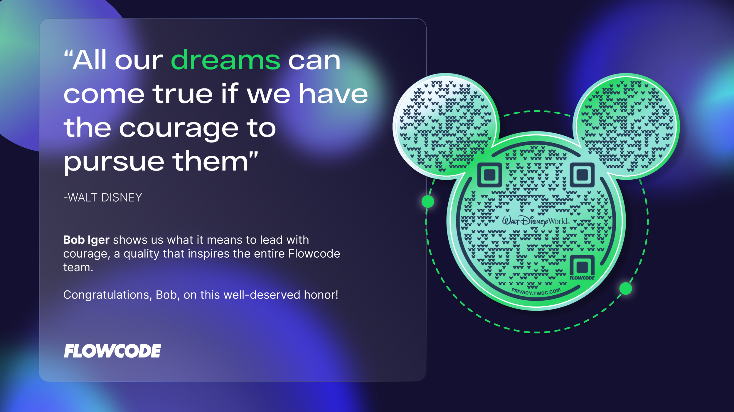
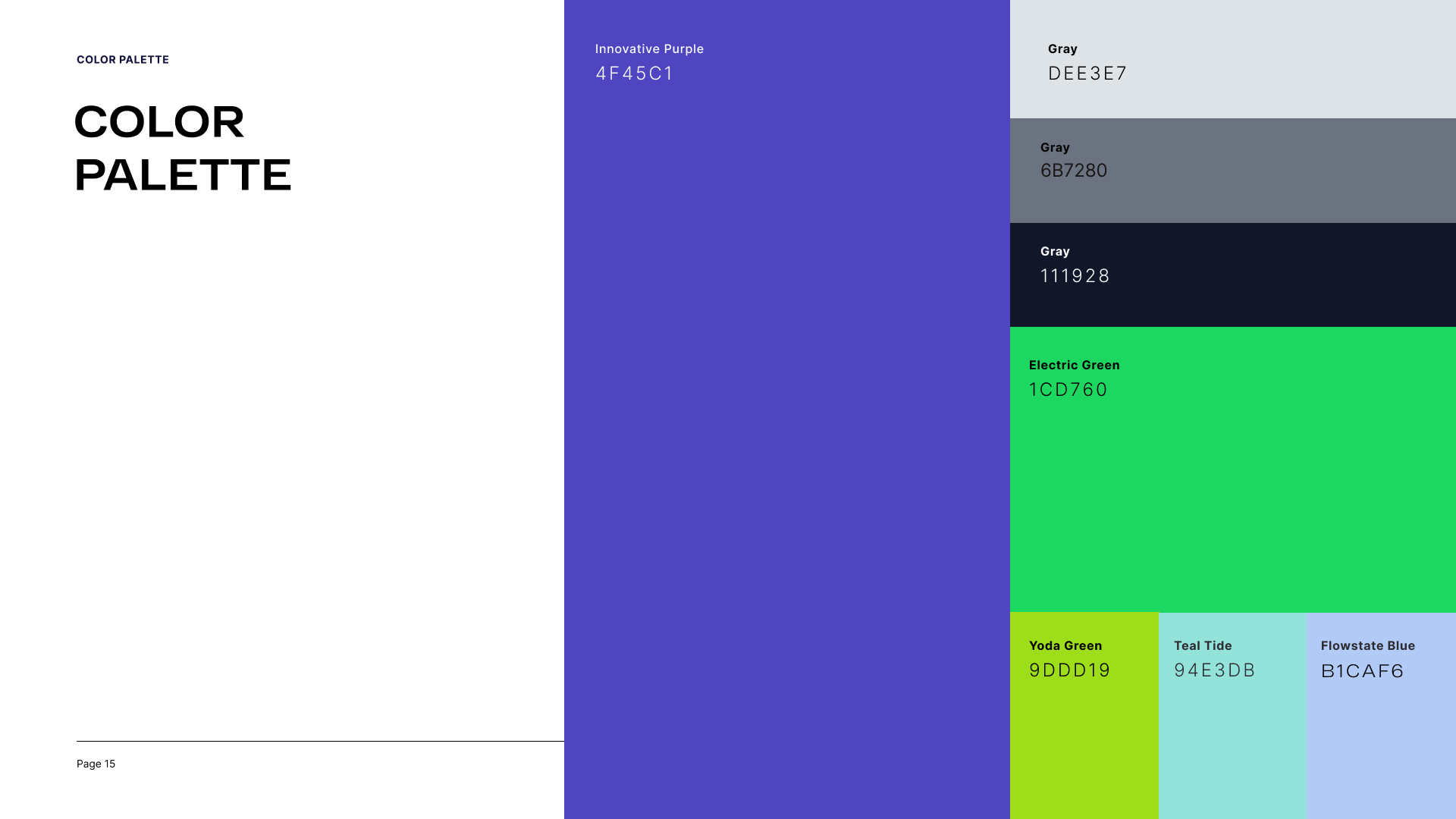
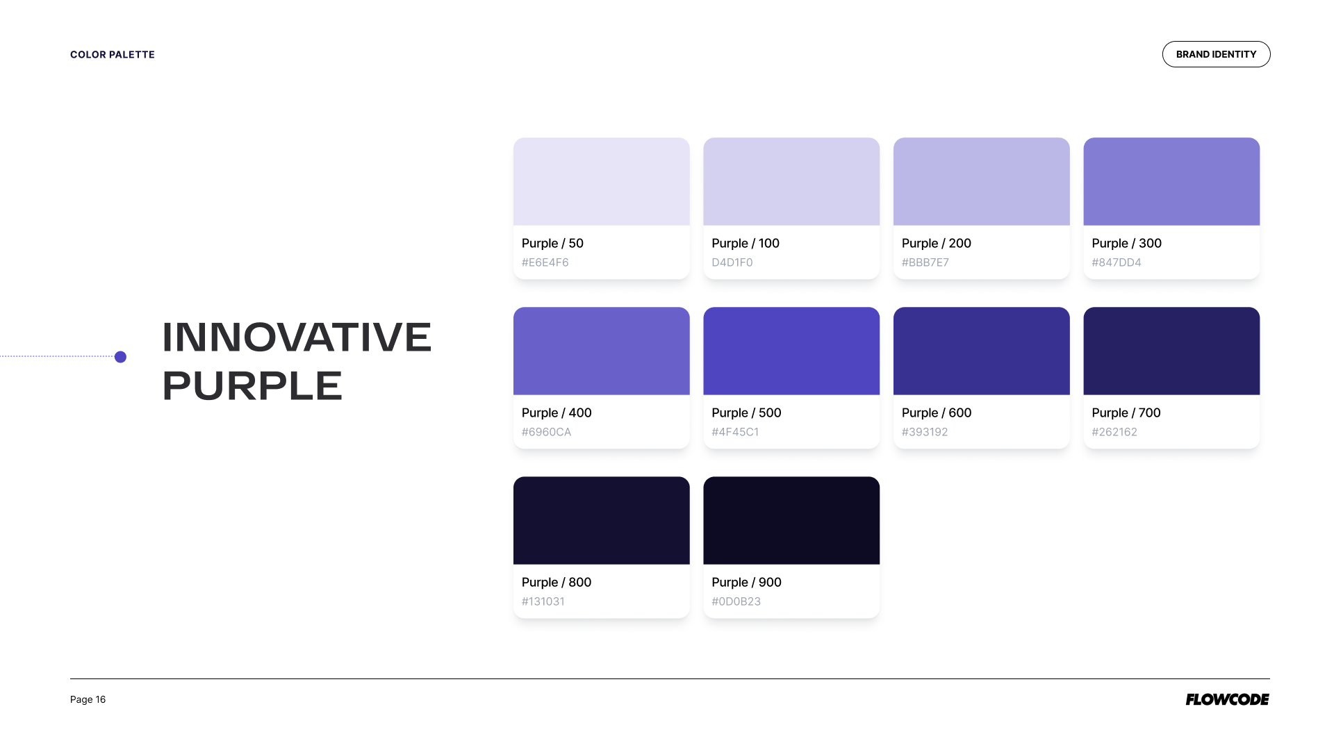
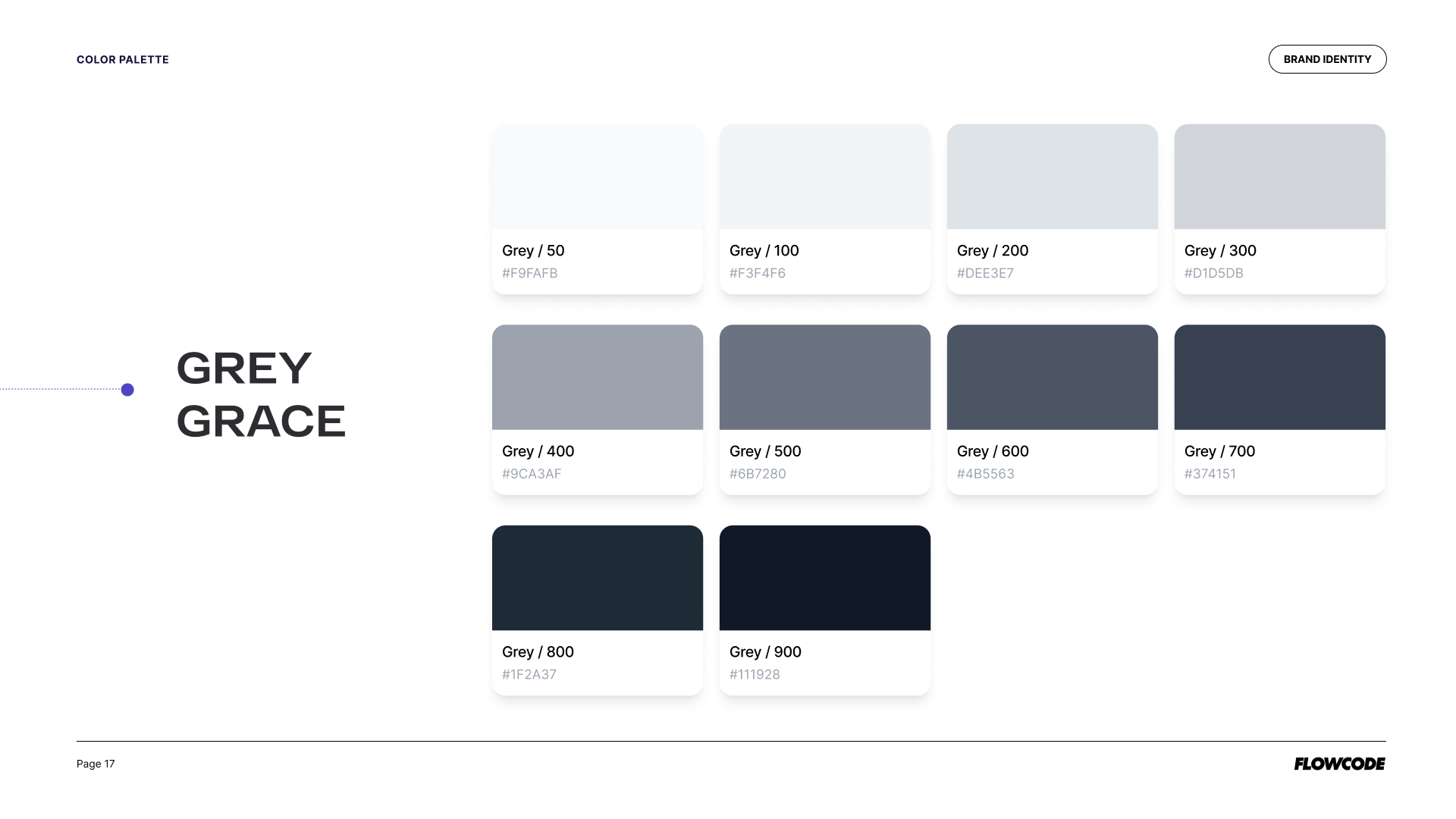
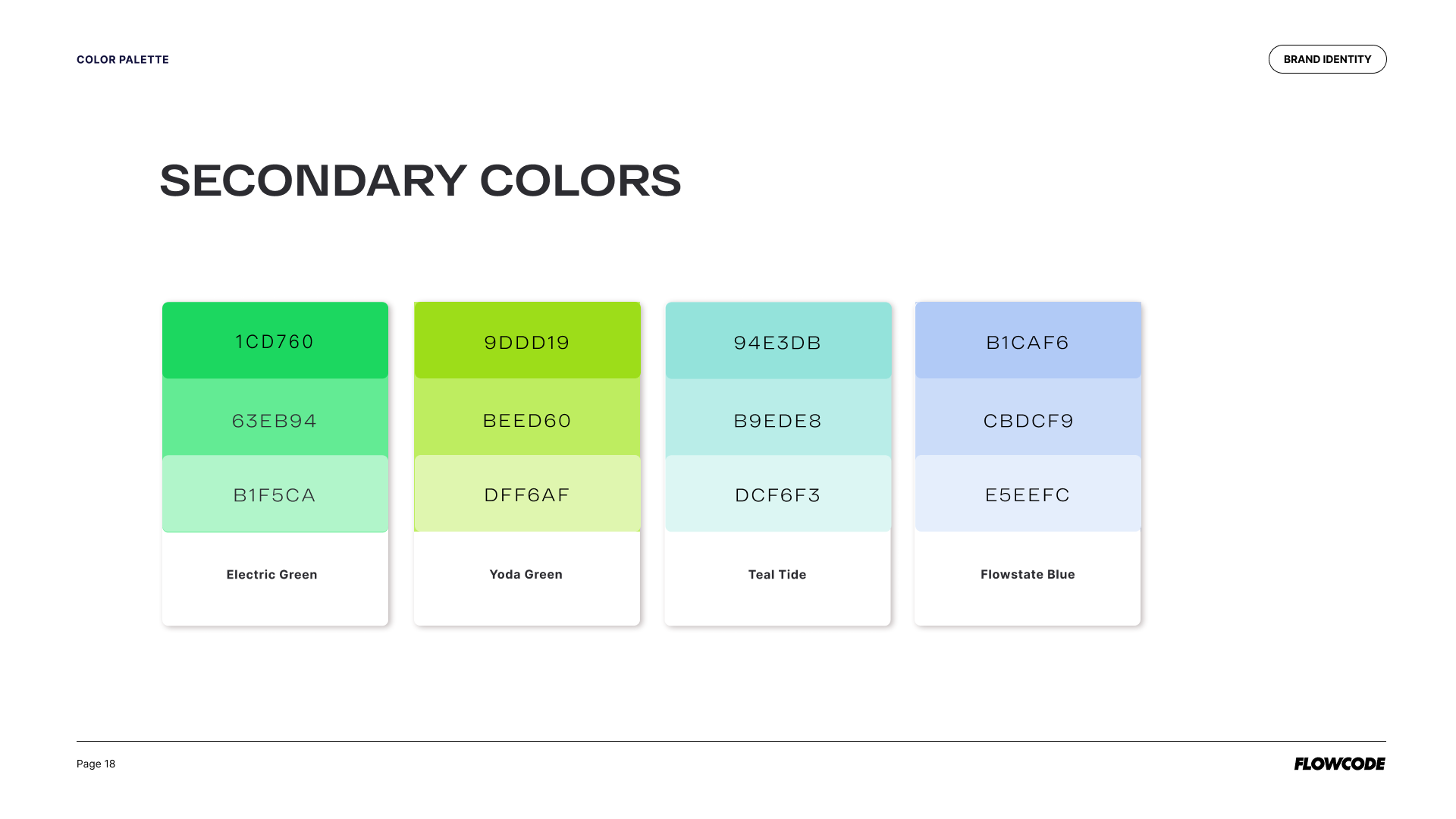
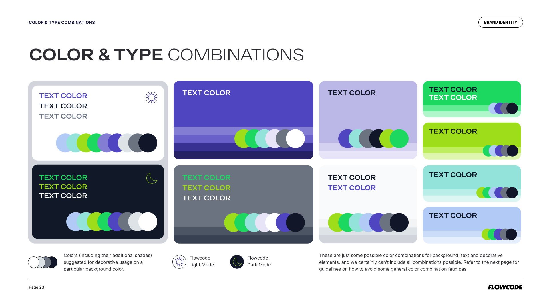
Fun, bold, and high-energy. That’s how we showcase our Enterprise brands and make our Fortune 500 partners the heroes in everything we do. Our color palette is strong and refreshing, anchored in vibrant tones with supporting grays and a purple range for UI/UX data visualization. Secondary colors flex with the seasons, and clear combinations across light and dark mode make it easy for any designer or partner to jump in and work cohesively across all mediums.
SHORT HERO VIDEO
Color Refresh
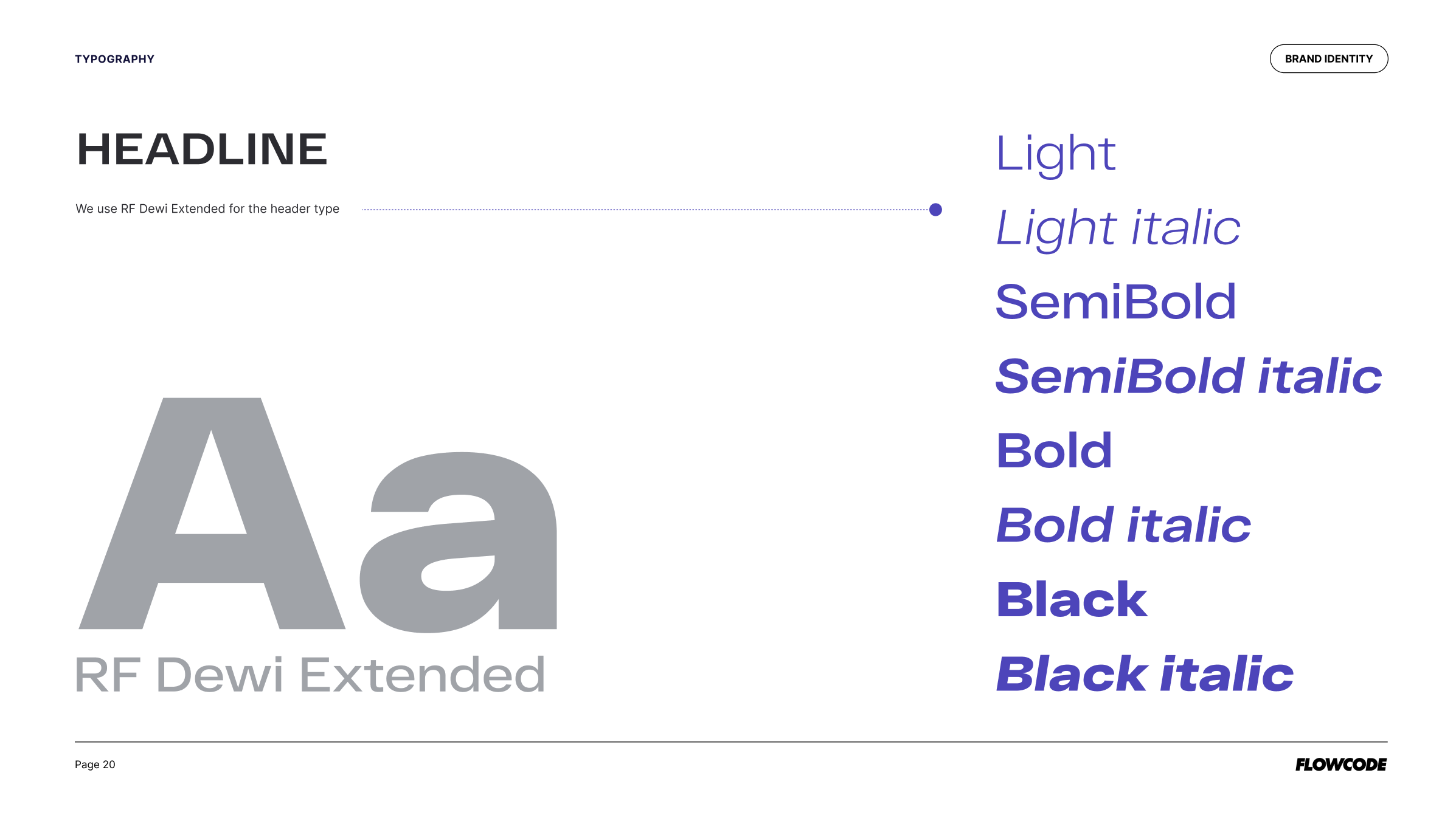
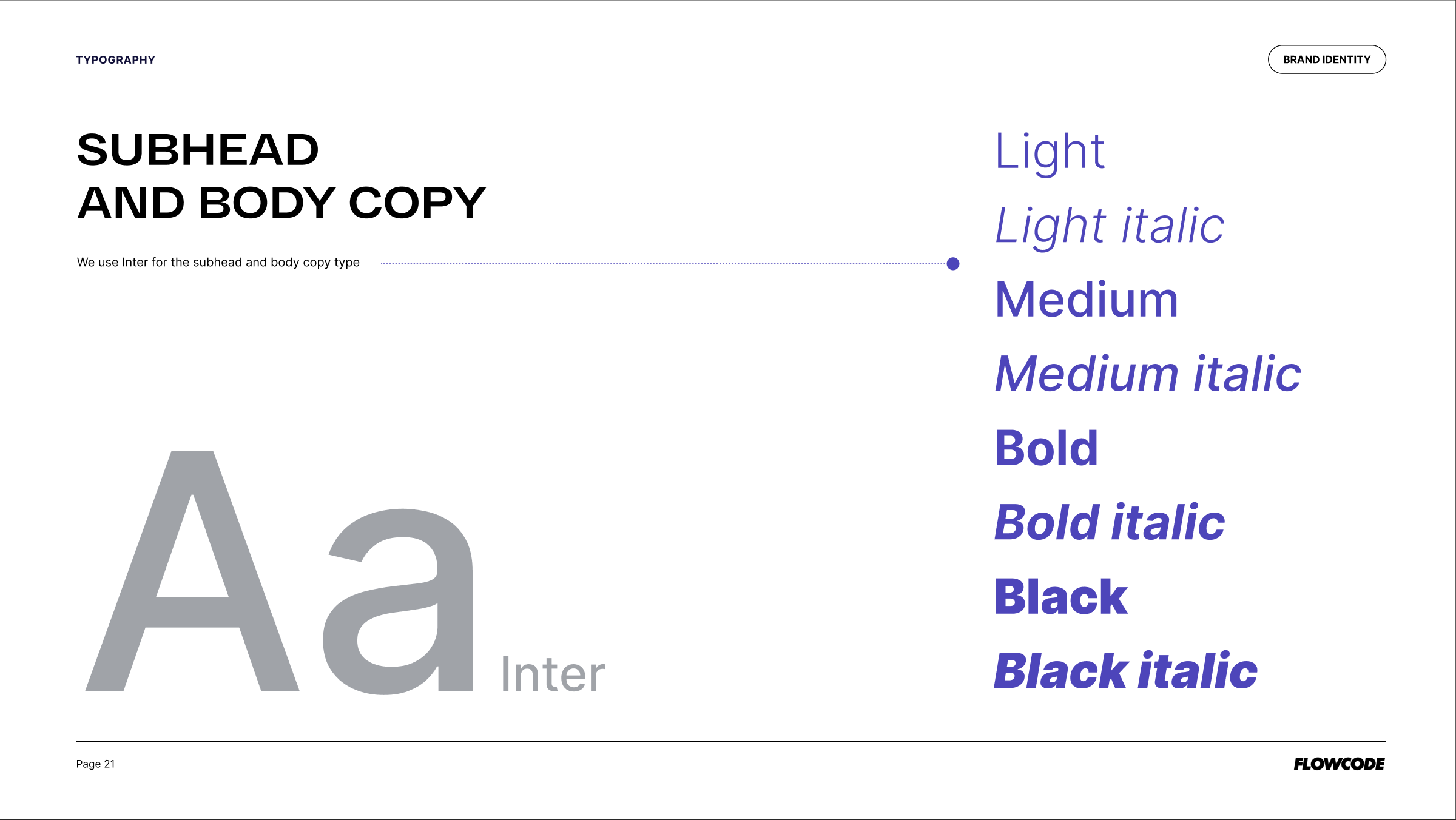
Typography
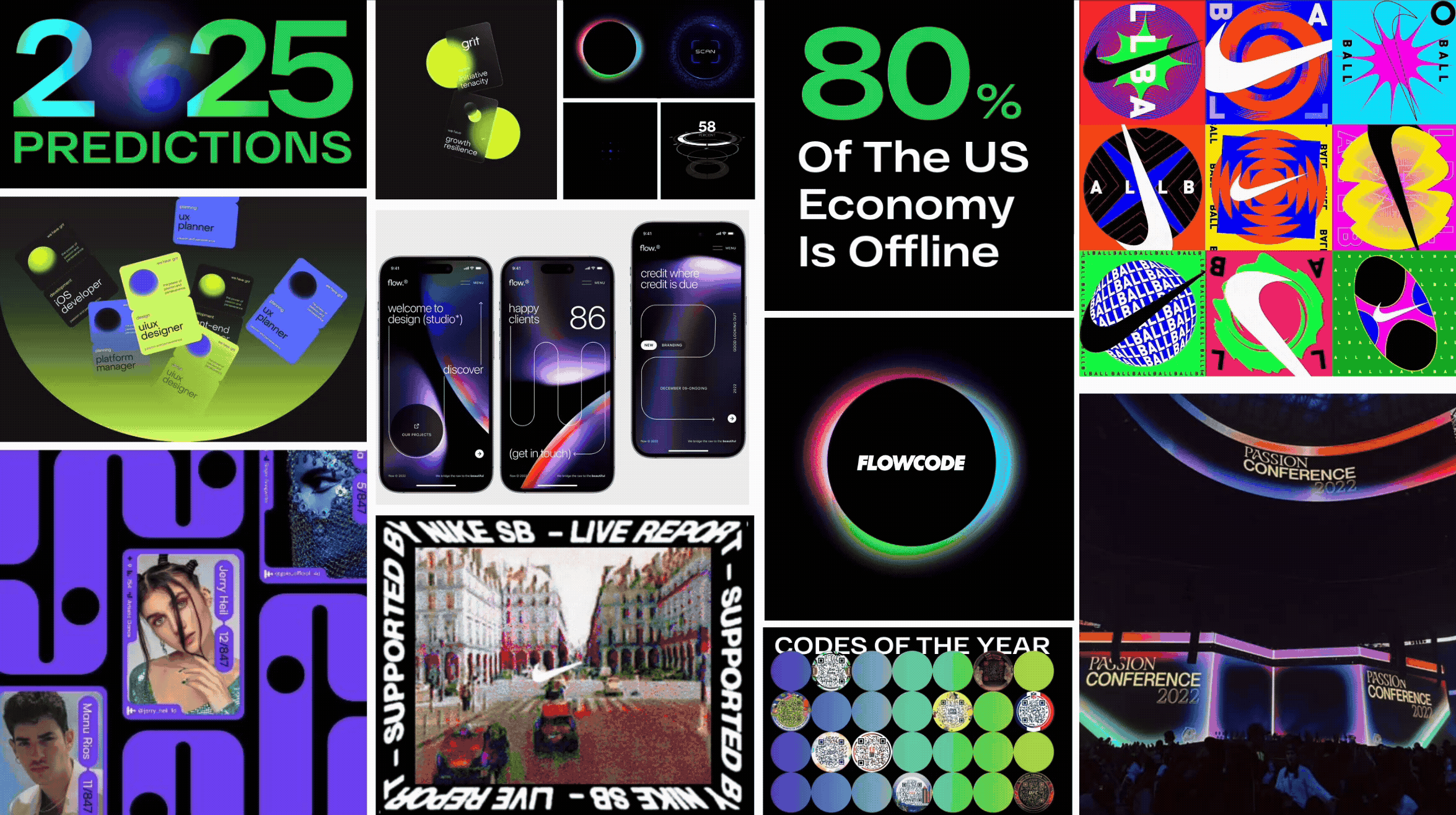
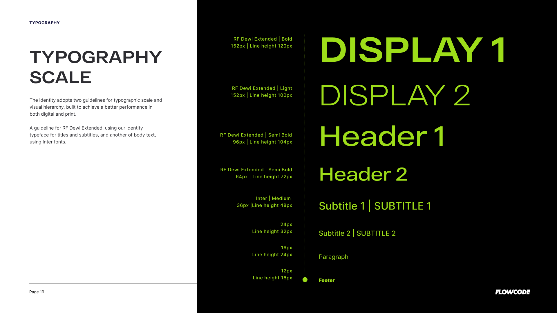
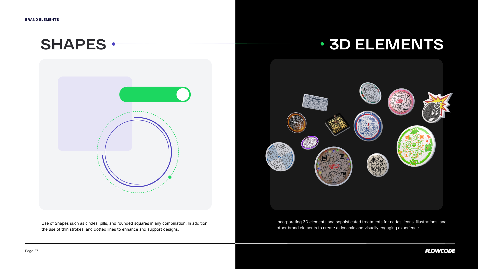
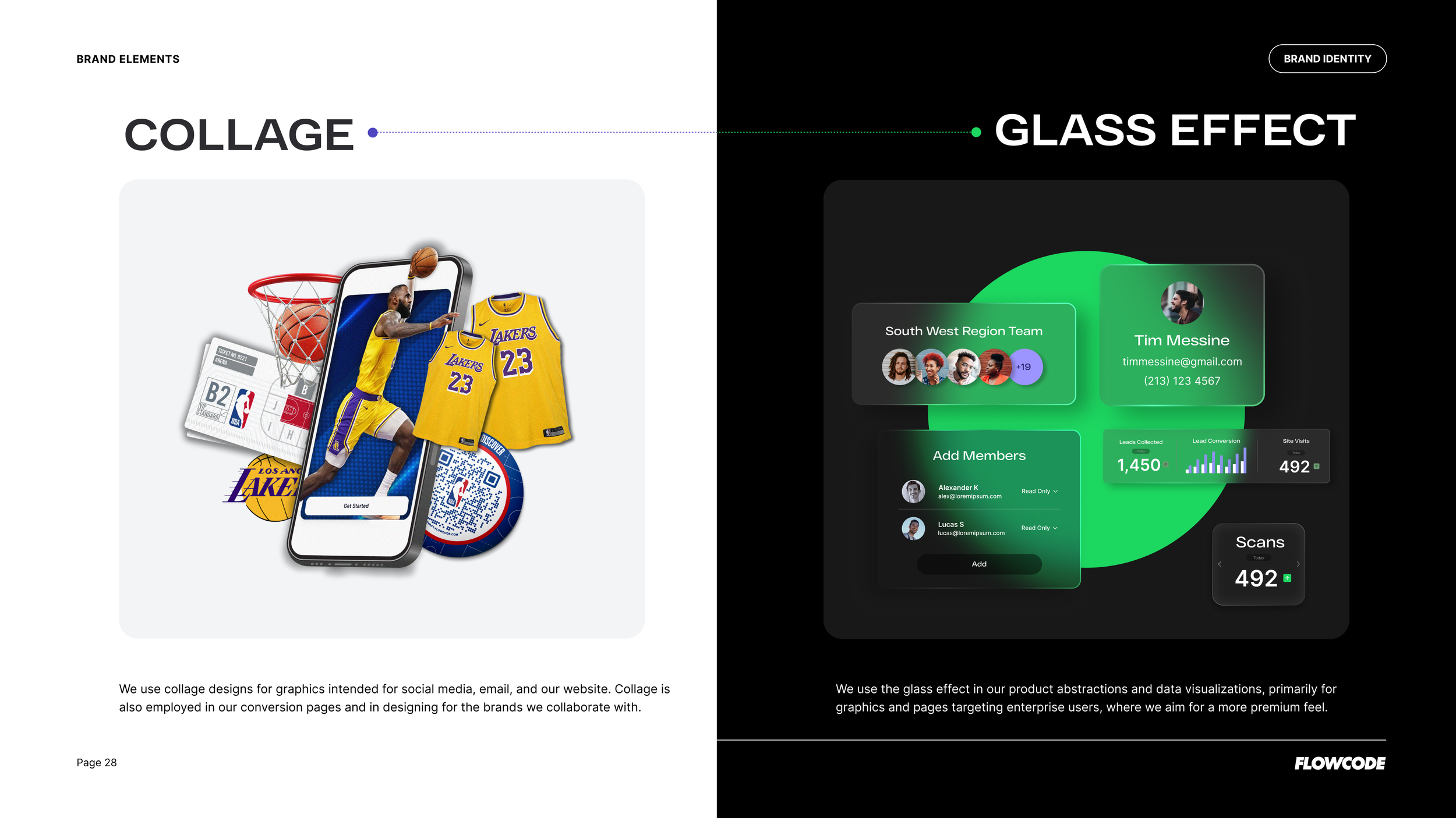
Our typography is tech-inspired with just the right amount of quirk, elevated by classic sans serif for balance. Graphic elements are bold, fun, and full of energy, bringing fresh life to the brand for younger generations while still being adaptable for older eyes. Collages get a modern twist, integrating client graphics with a powerful, dynamic vibe. Video direction ties it all together: innovative transitions, bold storytelling, and standout data moments (like 1.1B Flowcodes in real life). At the core, it’s about keeping things fun, simple, and easy and showing that we’re so lucky to work with the best partners in the world.
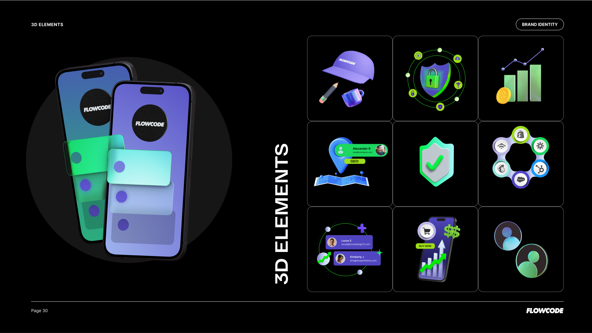
Elements & Graphics


Our tone of voice? Welcoming, direct and fun. We’re your friendly tech guide into the Flowcode world - we want you to feel part of the conversation, part of the energy, and ultimately, part of the flow.